MiRed is entering a new stage of growth and innovation, and our identity is evolving to reflect who we are today and where we are headed: a more visible, clear, approachable brand, ready to connect better with the people and institutions that trust us.
Because if MiRed evolves, its identity has to evolve too.
Why “MiRed”?
A name says a lot, and ours is no accident.
Mi (“my”) creates a sense of belonging. It speaks of what is ours, what is close, what belongs to each person.
Red (“network”) represents organization, connection, and strength. It is the sum of many parts working together to create more value.
Together, MiRed represents exactly that: many parts serving many people.
We didn't have to invent a story for the brand. The identity is born from what MiRed already is.
A brand that connects
MiRed connects financial institutions, sub-agents, and users to bring financial services closer to more people throughout the Dominican Republic.
Each participant plays a fundamental role.
Financial institutions expand their reach and strengthen financial inclusion.
Banking sub-agents bring services closer to their communities and create new opportunities for their businesses.
And people find a bank close to where they live, work, or go about their daily activities.
Our new identity seeks to represent exactly that ability to connect.
How our new image was born
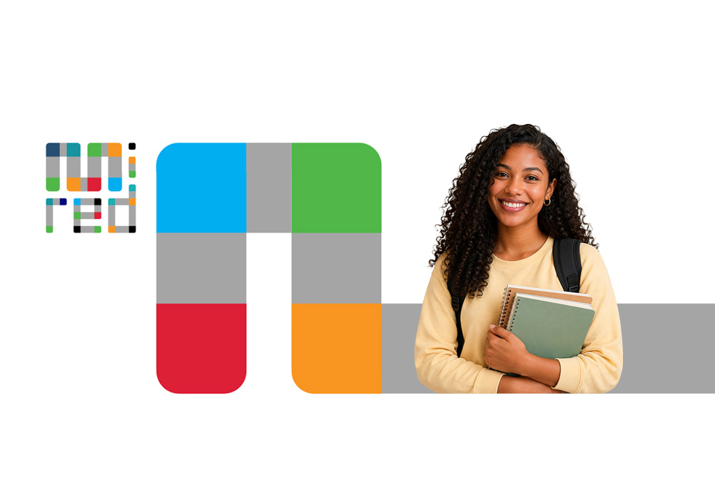
The new identity starts from a simple idea: a modular system that connects like a network to create an approachable, technological, and trustworthy brand.
- Every element of the system represents connections.
- The modular shapes speak of collaboration.
- The geometry conveys order, infrastructure, and technology.
- The colors reflect the diversity of the players that are part of MiRed.
- Nothing is decorative.
Every design decision seeks to communicate the trust, clarity, and efficiency that people expect from a financial service.
We are evolving our image, not our role
There is something that remains exactly the same.
MiRed is still the platform that connects capabilities, technology, operations, and access points to help financial institutions bring their services closer to more people.
Our new identity will make us more visible and recognizable, without replacing the role of financial institutions or their relationship with their customers.
Becoming more visible doesn't mean changing our role within the financial system. Quite the opposite.
Our role remains clear.
Financial institutions + MiRed + Banking sub-agents = Financial services closer to people.
We evolve because you evolve
The way people manage money has changed.
Today, people expect to make their transactions whenever they need to and wherever they are.
MiRed is evolving to respond to that reality and keep bringing financial services closer to more communities.
Because a network that brings opportunities closer also deserves an identity that represents them.
We changed the way we look, but not our essence.
We are still the same network, committed to connecting people, businesses, and financial institutions to bring financial services ever closer to everyone.